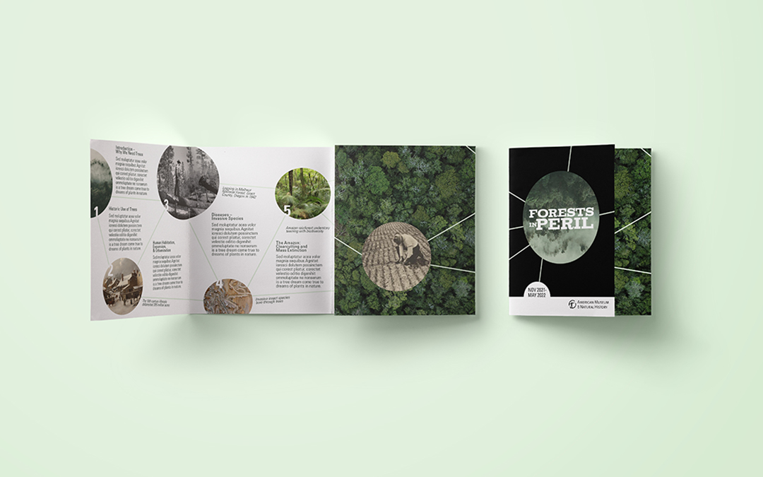


Forests in Peril
An interactive exhibition proposal for the American Museum of Natural History.
The graphic identity displays exhibition section content themes as a web of interconnected events throughout history. Included here is the floor plan, hybrid drawings of the interior rooms, mockups for an exhibition brochure, and sketches that demonstrate the process of developing individual section approaches.


Burrow Brand Identity
The branding package for Burrow (an ecologically minded modular sleeping bag system) began with custom lettered logotypes and a weasel icon, designed to communicate the warmth and resilience of the brand.
The identity was developed further and applied to packaging labels, playfully illustrative business cards, and fully outlined in a comprehensive brand standards guide.


Typographical Essay and Layout
Researching Neville Brody in detail lay bare his influence upon 80s and 90s type treatments, a style thoroughly affected by the rapid development of digital technology and influenced heavily by punk philosophy.
This article is presented as a magazine layout featuring samples of Brody’s type and images within a layout that emulates his approach to graphic design and typography.


Graphic Artist and Signmaker
for Whole Foods Market
Though the majority of this position was spent producing custom in-house print work in accordance with brand standard guidelines and toolkits, our most celebrated jobs were done with chalk pens.
Whether the message began 12 feet off the ground or was painted directly on the floor, the goal of supplemental signage was always the same: engage guests in innovative and delightful ways, often using humor to turn casual observance into a longer engagement.


Magazine Spread Layout
This magazine spread addresses mycological fascination, and features personal photos of mushrooms emerging across the gutter of the spread to put pressure against the text (an excerpt from Henry David Thoreau’s Walden) .
The title references the universal veil, an anatomical feature of certain gilled mushroom species that obscures their immature fruiting bodies.
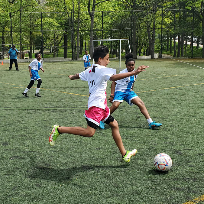
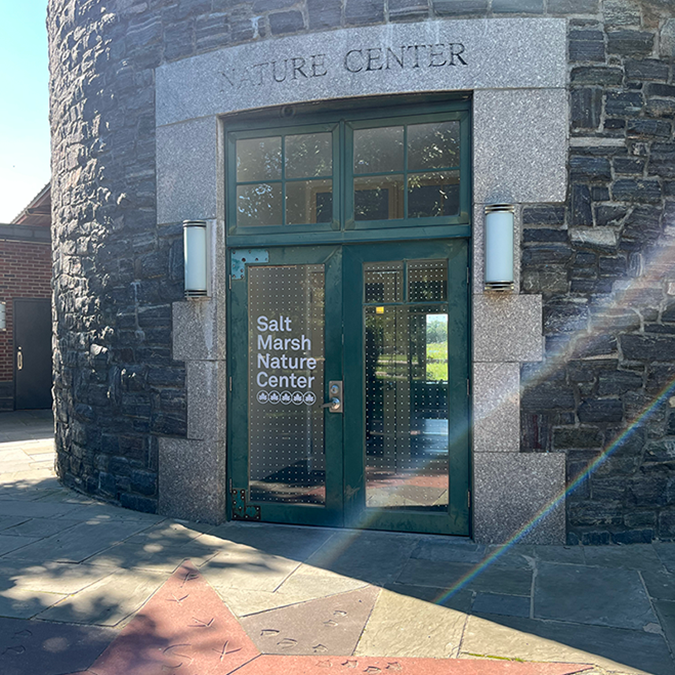
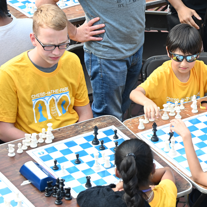
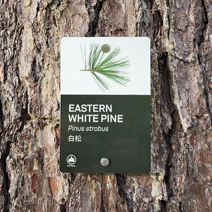
Graphic Artist
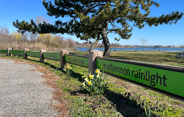
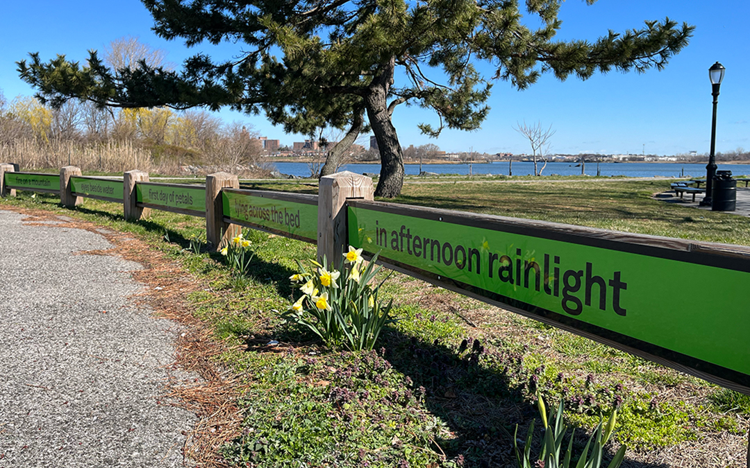
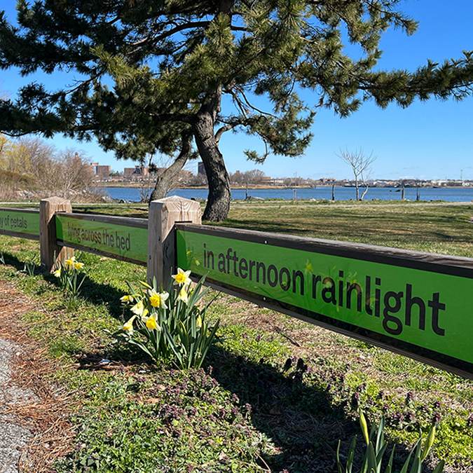
for NYC Parks
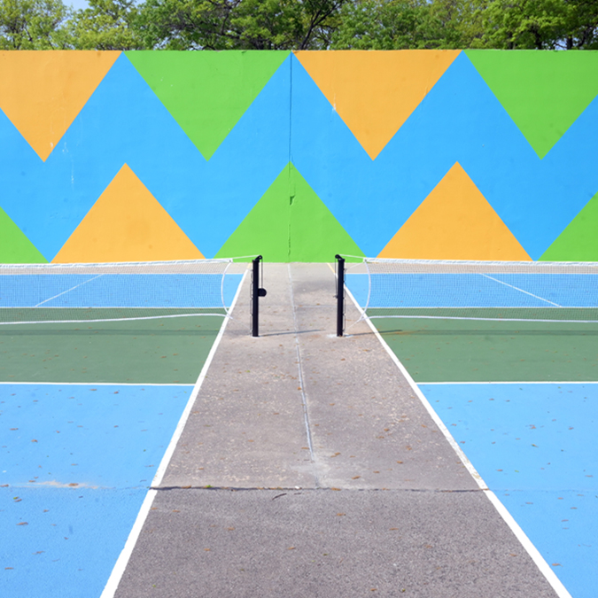
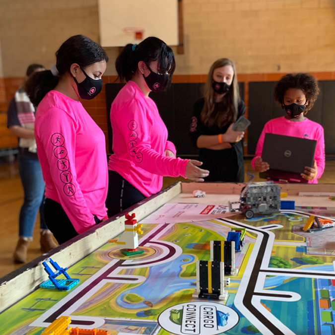
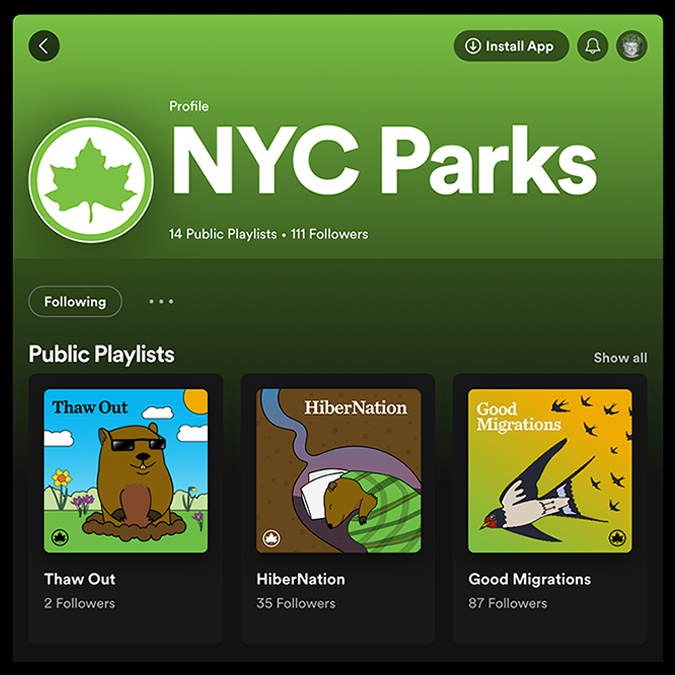
In all five boroughs you can see the positive impact that natural spaces have on the health of people and the environment. These images capture just some of the hundreds of projects I produced annually, where a multitude of design approaches were implemented to advance the branding of New York City’s world-class parks system. Images above include: Parks Poems installation series in partnership with the Poetry Society of America. Soccer uniforms for the annual Bronx Recreation Center Soccer Tournaments. Placemaking exterior vinyl with bird-strike deterrent pattern for the nature center at Marine Park, Brooklyn. T-shirts for youth participants in the annual Chess-in-the-Parks Rapid Open at Bethesda Fountain in Central Park. Multilingual and visual identification signage for trees in Crocheron Park, which led them to receive Arboretum status. Abstract mural design implemented at Orchard Beach to transform underutilized wall ball courts into an adult fitness and pickleball area. Team shirts and face masks for STEM focused robotics tournaments in Staten Island Recreation Centers. Illustrations for playlists on the Spotify account.